NEGATIVE SPACE
Known for his use of negative space and playful hidden messages, Israeli illustrator and graphic designer Noma Bar (1973) cleverly creates some thought-provoking illustrations, often with double meaning. The ability to tell a story through a few, well-considered marks is a skill that Bar has carefully mastered over the years. With a deft touch he can imbue simple graphic forms with political and social commentary, or manipulate everyday icons to create witty, double-take images that make you look once, twice, three times. Noma Bar can reduce the graphic nature of a topic without losing how profound the message it is, or place something in the mainstream media that might be too difficult to convey in another way. By finding the positive within the negative space, he is able to confidently present a subject, leaving you to discover the hidden thread and unravel the story. His designs are so simple, yet so clever you can’t fail to be impressed. By striving for “maximum communication with minimum elements” Noma Bar’s unique graphic style has become instantly recognisable throughout the world. The graphic artist's skewed view of the world has earned him a reputation as the master of illusory illustration.
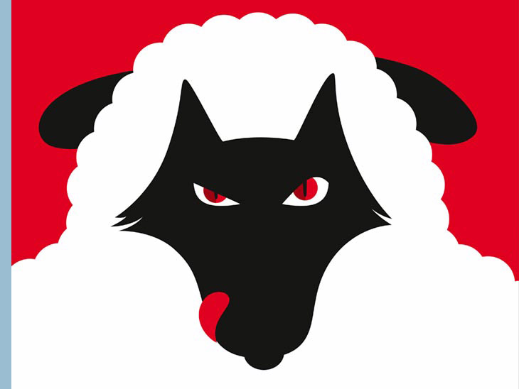
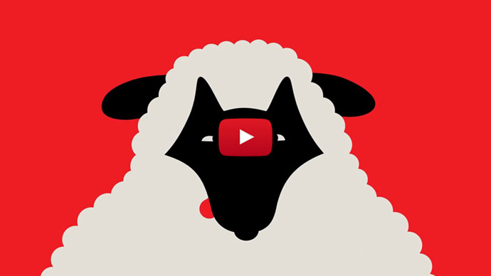
Wolves are experts at manipulating the people around them. Wolves in sheep’s clothing can be found in almost every setting. You can’t get rid of them, but if you can spot them, you can avoid falling into their traps.
As I flipped through my Facebook album 'Ads of the world I like', I noticed that a number of advertisements showed certain similarities. With a little more attention, several illustrations turned out to be of Noma Bar. When I entered his name in the search function of Google Images, the results were almost endless, but his one-page website consists of just his contact details. Apparently there are already enough web pages worldwide that show his very extensive portfolio or at least part of it.
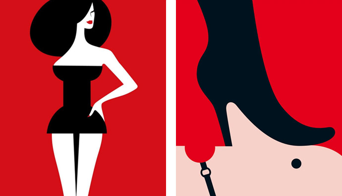
Funny how Noma Bar used a pin to become a woman's dress while the woman thus becomes a pin-up. These images illustrated a piece by the French sex columnist Maïa Mazaurette about learning how to enjoy being pinned down in conversation by beautiful women who have no interest in you beyond flirting and teasing.
"An artist using ‘negative space’ relies on the space that surrounds the subject to provide shape and meaning to the hidden images. Of course, the term also refers to any topic that conjures feelings of unease and discomfort." — Noma Bar
Noma Bar has brought his visual magic to the Omnibus Edition of Haruki Murakami's novel Killing Commendatore. In the story paintings become magic portals in this digressive, beguiling novel about an artist in flight from himself. All of the small details and hidden metaphors in Noma’s illustrations visually play alongside Marukami’s text.
Born in a small village town in Israel, into a family of artists living in Afula near Nazareth, during the Yom Kippur War in 1973, Avinoam Bar, better known to the public as Noma Bar, moved to London where he has lived for about twenty years, after completing art school and mandatory military service in Israel. His life, like his work, is full of stark juxtapositions. He grew up north of Nazareth, his father worked with trees all of his life and he was surrounded by family who worked extremely hard to be artists in a region that was bereft of the culture he craved. His aunt and uncle were frustrated artists because it was kinda forbidden. His first artistic memory was the work of his neighbour. He had a big tractor garage and when he retired he became some kind of artist. He created huge sculptures out of his tractor parts and other mechanical parts like steering wheels, chains, engines etc. and sprayed them all in black. This local hero was the one that showed Bar the power of ‘readymades’ — an artificial object that uses an apparent contradiction to illustrate a verbose point or to reveal a paradox — and how an object is given a new destination in a different space. Noma Bar just wanted it more and more to become an artist and drawing became his calling. “I saw you could take something and make it into something radically different, just by composition,” he said. “That is the basis of all my work now.”
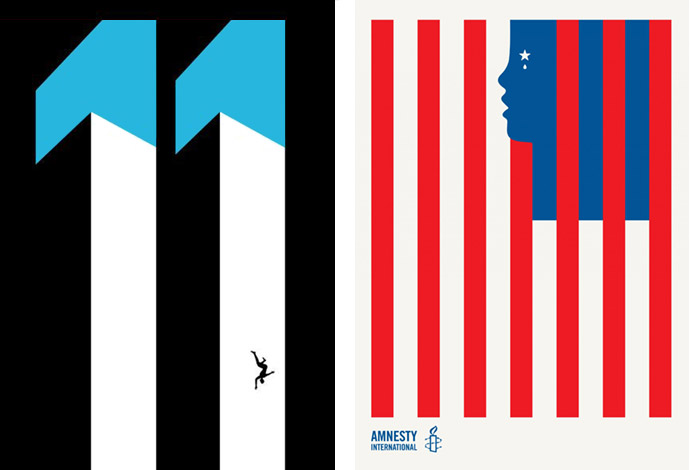
Left: Noma Bar’s series of book covers are excellent examples of what’s possible with a heightened use of contrast and a carefully crafted figure-ground relationship. All of this is encapsulated within these bold, minimal designs. This design was used to help promote the book, “Falling Man” by Don DeLillo. | Right: In 2018, creative agency Boys + Girls created a radio ad for Amnesty International highlighting the plight of oppressed parents and children, and raising the question of whether America can still claim to be the land of the free. The radio ad was supported by this illustration designed by Noma Bar.
As a teenager during the first gulf war, he had to spend some time in a shelter and while he was reading the newspaper he came across the hazard radioactive symbol in black and a yellow background. The longer Bar looked at it he noticed that it seemed like the eyebrows and moustache of Saddam Hussein, he added a military cap and jacket and all of a sudden it became very much like him, or at least a spitting image of him.
Having completed his schooling, he was drafted into military service and at the age of the 18. He spent his three years of compulsory military service in the Israeli navy, before going on to study traditional calligraphy and Hebrew typography in Jerusalem. Bar got through the serious period, like everything else in his life, by drawing and making everyone laugh with caricatures of the commanders. On leaving the Navy, which clearly left their mark: guns and tanks are recurring features, along with drops of blood, Noma spent a year working as a security guard in a hotel to save up for his next step: attending art school. The contrast to his structured, hierarchy-driven time in the military was stark. “It was very open and very much about thinking. It was an amazing time. Our teachers had studied at the Bauhaus and similar places. We never learned techniques. It was all about breaking the rules and creating things. There was a spirit of discovery and innovation,” he said in an interview with It’s Nice That.
"Every day I am on stage. Copy arrives at 12, then the brief changes at four, the deadline is seven … It’s nerve wracking. Tomorrow, millions of people will see my image. You just throw yourself onto the stage each day. I enjoy the pressure. Otherwise I wouldn’t do it. You never know what is around the corner and people keep surprising me with what they commission." — Noma Bar
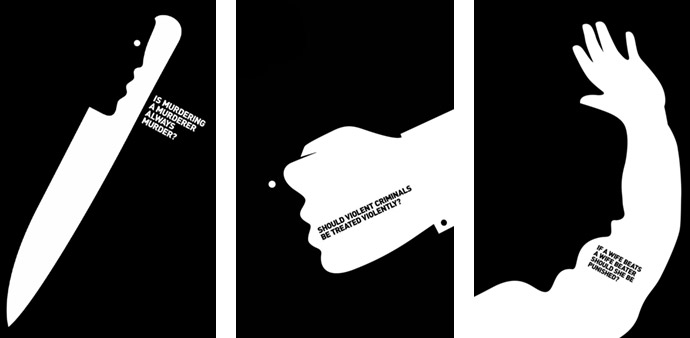
Commissioned by Bartle Bogle Hegarty, a British global advertising agency, Noma Bar has created this powerful series of illustrations for Injustice — a five-part ITV1 drama that follows a barrister, who has lost faith in the legal system but ends up getting involved in a new case. It is reminiscent of the golden age era of poster graphic design. It's stark and dramatic monochrome design pulls you in. A really lovely example of the perfect ad.
While studying typography, Bar began to think more seriously about negative space and understand its potential. The negative space took over in his studies and it then started to influence the storytelling in his work. To make ends meet, he worked for the national television broadcaster during his studies. During his morning shift he learned to work with editorial articles, among other things, such as to work quickly, to think fast and not to hesitate. Bar did some really boring things over there, like creating graphics for maps and financial charts, but he always looked for something else in it, hiding faces that only he could see.
Noma Bar graduated from Bezalel Academy of Art and Design Jerusalem in 2000 and headed straight to London. The city blew his minds. Bar took this image of Saddam Hussein with him when he moved to London and sent it to various magazines and newspaper offices while looking to further develop his imagery. His first assignment was for Time-out London; a portrait of Shakespeare in a similar style and more requests soon followed. Noma Bar's ingenious and uncanny illustrations have taken portraiture into a new dimension.
First in a series of films created to increase understanding of new therapies at the frontiers of medicine, “Unmasking a Killer” explains the science behind immunotherapy. Instead of 'talking lab coats' or difficult technical jargon, the film uses metaphor and story-telling, brought to life by a striking animation by Noma Bar.
Settling in north London he began to produce the work for publications and agencies, finding himself more and more in demand from art directors and publications, keen to use his way of telling stories through images. Whatever the brief, be it a commercial client, a publication or a commission for a charity or campaign, the Israeli designer’s belief in his responsibilities is resolute. “As designers we have power. If I can use my pen to say things, to affect and change realities, I will. It’s like a singer writing a song. If I work for someone like Cancer Research and can attract someone to donate to the cause through a poster, that is my contribution. It’s another voice. It can be a powerful thing.” Bar has been called to produce portraits of countless faces over the years. It’s something that endlessly fascinates him.
Most of the time, his inspiration comes from sitting in the woods. Since he moved to London, he has made Highgate Wood his studio, diligently sitting among the trees with his sketchbook from 9am until 4pm every day, come rain or shine. His work comes from a very quiet place as he described the process of layering sketches by hand, before producing the final graphics later on his computer. The software is what gave him his style. Aldus Freehand and Adobe Illustrator made it so easy to make his simple shapes in flat colours. His style — bold block colours — has a rich range of precedents, with echoes of Russian constructivist propaganda and art-deco film posters, as well as the sharp, knowing tradition of designers like Alan Fletcher, Milton Glaser and Paul Rand — who famously rebranded IBM in 1981, with an eye and a bee alongside an M. Bar followed in his hero Rand's footsteps, produced a series of posters and animations for the computing giant with a similarly pared-back approach.
When asked if he ever thought of working as a designer or rather work purely as an illustrator he answered he likes being involved in the design process of how his illustrations are used and he thinks 'graphic art' is a better way to label what he does.
Global affairs and politics always influenced his work. His birth celebration was only with women, as all the men were in the army on the front. So political movements and conflicts were dominate part of his life and still are. Noma Bar’s work has been exhibited and published extensively responding to subjects ranging from war crimes to online porn. Over the course of his career his images, that playfully tackle these far ranging topics, have become known for the juxtaposition — the fact of two things being seen or placed close together with contrasting effect — within the imagery and his mastery of negative space and a large solid color area.
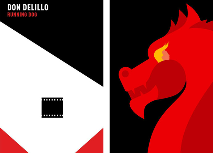
Above left: Don DeLillo's Running Dog, originally published in 1978, follows Moll Robbins, a New York city journalist trailing the activities of an influential senator. In the process she is dragged into the black market world of erotica and shady, infatuated men, where a cat-and-mouse chase for an erotic film rumored to 'star' Adolph Hitler leads to trickery, maneuvering, and bloodshed. | Above right: Donald Trump against the dragon for Die Zeit.
Below left: Paper manufacturer Fedrigoni and Álvaro López, a London-based Spanish graphic designer, have organised a collaborative project with 19 Artists to show their support in the fight against COVID-19.This is a limited edition poster of 75 prints (Sold out), by Noma Bar. To accompany the poster, his design was adapted into recyclable paper face mask. | Below right: Luxury goods during coronavirus for British GQ Magazine.
"There isn’t one way to do it. There’s something in me that wants to strip things down. No one knows the pain and sweat that goes into making each work. It’s like being a musician or a dancer. You might see the sweat on the stage, but you don’t see everything that has gone into it. I’m not crazy about showing that process, I want to keep things for myself. Theres a lot of deleting and starting again." — Noma Bar
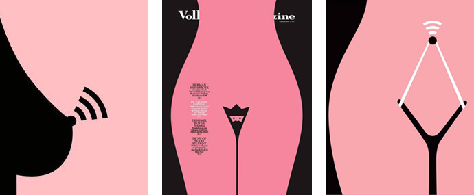
Online Dating | King Vagina, Noma's cover illustration about Thailands famous surgeon Dr. Preecha who is known for turning man into woman.
You've probably seen one or more of his strikingly graphic award winning images in publications. The Israeli designer, and author of the covers of many books of Don DeLillo and Haruki Murakami, has been working in London with a lot of big names and media outlets including brands such as Coca-Cola, Penguin, IBM, Vodafone, BBC, The Observer, Der Spiegel, The Economist, The New York Times, The Guardian, Wallpaper, the BAFTA brochures for the 2009 awards show and many many more, and he's been shown in galleries all over the world. Norma Bar has been taking the international world of editorial illustration by storm. His creative drawings have been used for over sixty magazine covers and he has published over 550 illustrations also releasing a few books: Guess Who – The Many Faces of Noma Bar, in 2008, Negative Space in early 2009 and Bittersweet: Noma Bar in 2017, a “mid-career retrospective” with Thames and Hudson. The lattest is a dazzling celebration of one of the most acclaimed illustrators working today, also available in a limited, slipcased edition and weighs no less than 3 kg, a five-volume retrospective volume box set detailing his favourite works from over the course of his career that splits his portfolio thematically between: Life Death, Pretty Ugly, Less More, In Out and Rough Smooth.
He has received numerous awards, such as the Gold Clio Award, the D&AD Yellow Pencil Award, the Golden Lion Award at the Cannes Lions International Festival of Creativity.
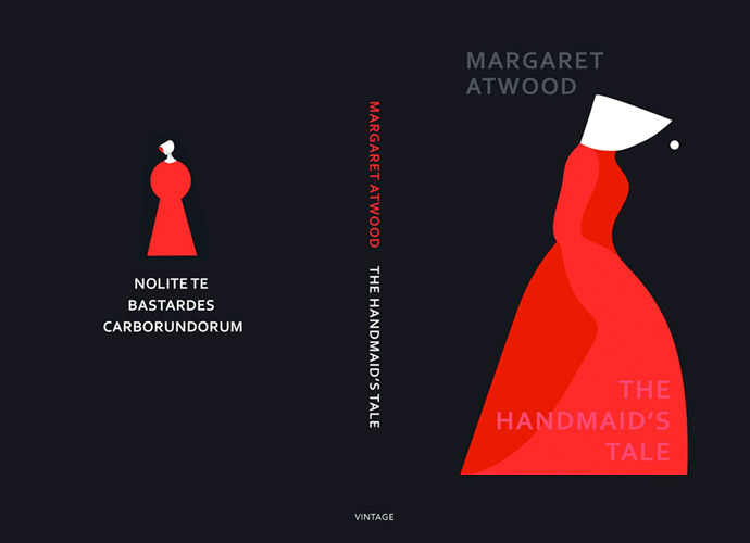
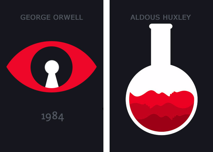
Dystopian Trilogy: A truly marvellous new edition of Margaret Atwood’s “The Handmaid’s Tale” has been released in hardback by Vintage. Against a charcoal black background is a single stylised profile portrait of a Handmaid with sculptural red gown and triangular bonnet. This figure then appears on the reverse but this time smaller and forward facing, creating the shape of a keyhole and showing a face in half profile topped with the bonnet. It’s not the first time that Noma Bar has taken on the challenge of bringing Atwood’s words to life. He previously worked with Vintage creative director Suzanne Dean on the covers for its Dystopia series, which included classics such as George Orwell’s “1984” and Aldous Huxley’s “Brave New World”.
"As part of my research, I read a lot. Then I think and do a lot of sketches. I’ll never go to work on the computer unless I have ideas first." — Noma Bar
Illustrator Noma Bar is known for creating an artistic relationship between elements that give meaning and dynamism to his designs, resulting in a meaningful merge of the said elements. The prize winning-artist shows us how we are truly living in the golden age of book designs through illustrations of popular dystopian fiction, such as Atwood’s The Handmaid’s Tale and Orwell’s 1984. Bar’s art brings together proximity, minimalism, and negative space to portray the powerful messages incapsulated in the novels. The simple, yet perfectly chosen contrast between the red, white and the charcoal black are surely the means in which Bar successfully chose in alluring reader to revisit these masterpieces.
MUCINEX | Back to normal is up to you
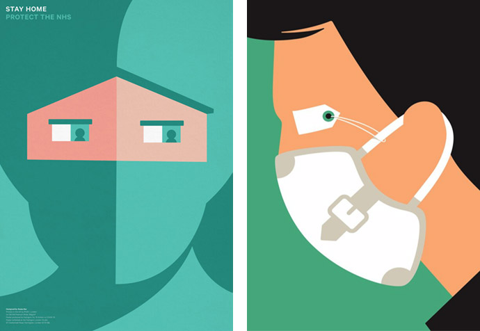
Noma Bar created a series of social superhero illustrations and Instagram stickers to reinforce the idea that while staying home may be boring, doing so makes people superheroes alongside first responders, healthcare workers and other essential employees who are risking their lives during the coronavirus pandemic. Bar’s deceptively simple and highly imaginative works combine a clever use of negative space and bold design techniques, to show that by being a #boringhero, everyone can be a helper; keeping the front-line heroes — first responders, healthcare workers, grocery employees, mail carriers and so many others — safe and healthy.
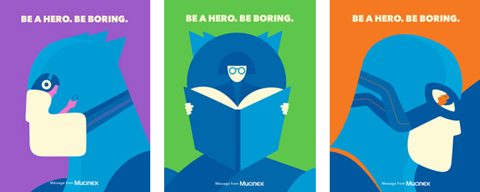
Mucinex teamed up with creative agency McCann New York, McCann Health New York and award-winning illustrator Noma Bar on a content series on Instagram that emphasizes the importance of social distancing.
Cold and flu brand Mucinex said top influencers would help spread his work via Instagram Stories. Mucinex vice president marketing Claudine Patel said, “The science shows that staying in isn’t exciting, but it does save lives. So much more than simple words, these vivid and original visuals invite consumers to show off their superhero creds by donning capes and masks and have more fun while performing mundane tasks, such as vacuuming, making a sandwich or simply taking a nap.” Bar’s clever illustrations helped translate the contradiction of being a #boringhero in a powerful, spirited and fun way. We should be fighting back by embracing these mundane life-saving techniques with an added dose of fun.
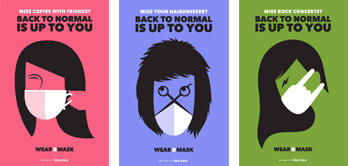
Noma Bar’s new collection of images brings to life the PSA (public service announcement) campaign messages in ways both entertaining and thought-provoking. With drawings that utilize Bar’s famous ambiguity style, coffee mugs, cruise ships and a rocker's hand double as masks, with copy that asks, “Miss coffee with friends?” “Miss your hairdresser?” and “Miss rock concerts?” bringing to life the “Getting Back to Normal is Up to You” campaign focus and the call to action to “Wear a Mask.” The six-ad series reminds people to wear a mask if they want to get back to their normal life amidst the ongoing coronavirus pandemic.
MAD MEN | Into the #MeToo spotlight
Mad Men is American period drama television series in an advertising agency in the 60’s, showing how the seemingly glamorous lives of those who work there are always undercut with a dark secret. The running themes throughout are the raging racism, sexism and misogyny of the era. With these strong underlying themes, Noma Bar also had to figure out a way in which to communicate all of this information through his signature negative space style.
Bar has effectively communicated these ideas through his style by basing the main shape outlines in the suits worn by every man, a status of power and a gentlemanly cloak for the unsavoury characters. The use of woman’s legs in heels with a short skirt conveys how the appearance of the women in the workplace is constantly commented on, and how they are seen to be there only to do their job and serve as a ‘bit of fun’ for the men. The tie outline created by the legs makes the suit more obvious, and the use of the city outline in shades of black hints to the late nights on the town the men spend, cheating on their wives, and echoes the connotations of power, presence and masculinity associated with a black suit.
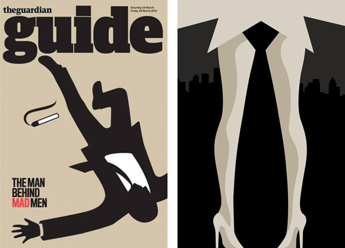
Noma Bar has effectively solved the problem of conveying the subject of toxic masculinity and misogyny in an era where it is becoming far less tolerable — with the likes of the #MeToo movement and the exposure of predatory characters in positions of power. By creating these subliminal but clear social cues of internalised sexism within his design, Bar has kept the design relevant to the contemporary market while also commenting on the social aspects of this time period, all the while creating a modern vector image design.
COCA-COLA | What is the real face of a city?
In 2017, Coca-Cola China put billionaire investing guru Warren Buffett’s face on Cherry Coke cans. Coca-Cola said Mr Buffett's “investing success” had “become legendary” in China, but don't you think there's a better way to launch Cherry Coke than with its best-known fan on the package? But he was not being paid for his appearance on cans.One year later, it’s celebrating the nation’s unique local markets with a series of 23 limited-edition “sleek cans” that feature the people of China. Illustrator Noma Bar incorporated iconic cultural elements of each city to express the personality of its people, as mixed with Coca-Cola iconography. Digging deep into each city’s culture, they were able to capture the essence of each one: its culture, its food, its idiosyncracies as well as its landmarks. They personified these on each can through a seamless blend so that each city became a face, each one unique and surprising.
In 2018, Coca-Cola Great Britain was set to unveil their latest marketing campaign: We Do. The campaign was a celebration of Coca-Cola Classic, as well as the uniqueness and specialness of the 132-year-old Coca-Cola Company featuring images of icons Elvis Presley and Marilyn Monroe by Noma Bar and UK design agency Recipe.
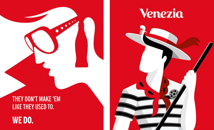
Left: The 'We Do' campaign is a celebration of Coca-Cola Classic, and the specialness of the 132-year-old global phenomenon | Right: 'Face of the City' is the limited edition of Coca-Cola dedicated to Milan, Venice, Florence, Rome, Naples and Bari.
In 2019, Coca-Cola tried to answer this question and paid homage to six Italian cities with ‘Face of the City’. The protagonists of this limited edition dedicated to Milan, Venice, Florence, Rome, Naples and Bari consisted of 6 faces, a journey across the peninsula which was also a declaration of love by Coca-Cola towards the country where it has been present with its plants for over 90 years. Faces that told a story, designed by Noma Bar. Noma Bar has captured the essence of every city, imagining its identity and enriching its personality with symbolic elements. Looking at the six faces, it's possible to recognize the most representative symbols, from architecture to landscapes, from food to characteristic elements, up to the most famous events. Milan had the face of a hipster who, over a T-shirt with the facade of a railing house, wore a scarf in which you could recognize the silhouette of a tram, while in his long beard you could see the skyline of the Lombard capital. A gondolier with the characteristic striped T-shirt, between Carnival masks and cinema films, was a tribute to Venice. Florence revealed itself in the details of a young woman's clothing: from the ornaments of her dress, the hair clip, to the precious earring. Rome and Naples also had a woman's face: that of the capital was sophisticated, with the shape of its stairways outlining her dress and a wide-brimmed hat; the Neapolitan one was more self-confident, whose clothing was full of symbols of the city, from pizza to lucky croissant. ‘The Face of the City’ journey finally ended in Bari, with a tribute to the seafront and its beauties.
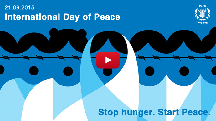
In 2015, on the occasion of the International Day of Peace , some world brands joined forces to economically and ideally support the fundamental role of food assistance in creating a more peaceful world. Among the projects carried out in solidarity with WFP there is also “Stop hunger. Start peace.”, the 30-second animated commercial with illustrations by Noma Bar and the narrator of Irish actor Liam Neeson.

The broadcast PSA is an infographic directed by Noma Bar in 2018, animated by Ale Pixel Studio and produced by Dutch Uncle NYC with a script written by creative agency, Wondros.
VIRGIN | Velocity of money
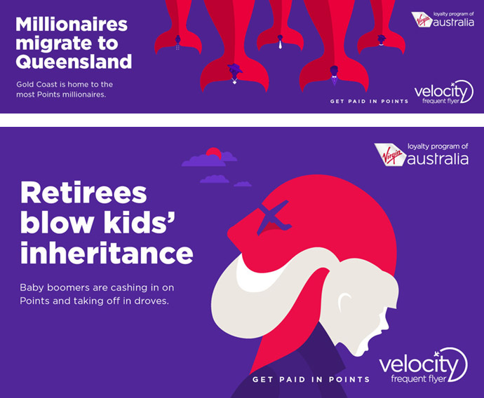
Noma Bar brought his inimitable silhouette style to a new campaign for Virgin Australia's frequent flyer program, Velocity, that references topics such as Trump and Brexit. To illustrate that more flyers are going to Europe than Britain using their points, the design shows Boris Johnson getting kicked in the face by a boot. And to show that “Asia trumps America,” there's an image that mimics Donald Trump being picked up by chopsticks. Other more local examples include “Millionaires migrate to Queensland,” with the millionaires morphed into the tails of whales, to illustrate that Australia's Gold Coast is home to the most points millionaires.
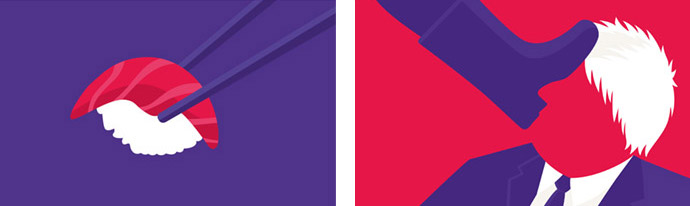
One design showed Trump transformed into a piece of sushi, and another showed British Prime Minister Boris Johnson getting kicked in the face.
Stay amazed!
All images courtesy of the artist.
More story related movies/interviews:
Related stories on Woodland: