SIMPLIFIED TO PERFECTION
Malika Favre (1982) is a French Algerian artist who needs little introduction. Her work is incredibly popular, largely due to its instantly recognisable style that sees her create beautifully bold vector illustrations with her unique skill at the art of simplifying down an image to its bare essentials. When we set eyes on the creations of Malika Favre, it’s as if our entire imagination has been seized by a spiral of colours and patterns. Clear flat tints, asserted like an encounter between Pop Art and Op Art, two movements that evoke the sixties. A sort of time machine made of lines and counter-forms where simplicity reigns supreme. The use of positive and negative space plus colour creates a strong visual aesthetic that has established her as one of the most sought after graphic artists. Meet the illustrator behind the seamless illustrations which are not only physically beautiful, but also touched with intellect and wit. Her images lead the viewer’s eye around, and in a way, they all tell a story, mostly about women.
The very first time I came into contact with graphic work by Malika Favre was in 2010. I scoured the internet looking for interesting alternatives to display an alphabet. At the time I was researching what was moving on in the landscape of typography. You have typographers who literally design a new font and you have artists who create an alphabet in a different way. That's how I discovered, among other things, the erotic alphabet of Favre. I contacted her to ask how and why these came about.
Wallpaper* then asked Airside's (s)expert in residence to transform her erotic Alphabunnies — sexy ladies with rabbit heads in alphabetical positions — into a new alphabet of naughty girls for their themed edition on Sex and Art. Favre decided to draw a series of pin-ups. The set became more organic and the poses were more advanced than the Alphabunnies but the spirit remained the same; sexy women exploring the joys of foreplay. It became a very graphic alphabet that made optimal use of the negative spaces. Favre's obsession had to do with her French perverted mind, but it all started when she was a child. She drew princesses, naked women and sexy drawings. There were no boys in her sketchbooks: hips and curves were much more dramatic and fun.
A tache de beauté or beauty mark is a euphemism for a type of dark facial mark so named because such birthmarks are sometimes considered an attractive feature. The tache de beauté is usually located on the left or right side of the face, between the nose and mouth, drawing attention to the red-painted lips of women. This description fits perfectly with the image logo of the French illustrator now living in Barcelona. She herself has a piercing in a similar place. She grew up in the Paris suburbs. She has been into drawing since she was very young but it wasn’t until much later that the Parisian realised that she could make it her profession. By the time she was a teenager, an artistic career didn't seem viable at all. She never believed it could be something that could lead to a career. She didn't even realize graphic design existed as a profession.
Before she went to art school, she happily studied maths and physics as she was fascinated by science as a child. But after a couple of months in prep school studying like a maniac and barely seeing the light of day, she realized she was never going to be happy doing that as a living. Her parents taught her that real wealth was freedom. Freedom to do as you please, to travel, to change your life, your city and above all to choose a profession that you love. At 19, Favre acquired her artistic background in Olivier de Serres in Paris and Surrey Institute of Art & Design, the leading art college in the United Kingdom. She chose advertising rather than fine art and still had no intention of becoming an artist. She thought she was going to become an art director in an advertising agency but she has never spent a day working in an ad agency. Favre graduated three years later with a BTS-Bachelor in graphic design and a longing for adventure.
Her first creative job ever was at Unit9 doing web and digital, funnily enough. She ended up doing more illustration than design there, creating prints for the studio deco and Christmas cards. In 2004, she got offered a job at Airside, a small but very creative multidisciplinary London studio that had a very illustrative approach to design and animation. Her job at Airside had a big role in what she does today. There, she learnt to simplify things and tell stories which became a key part of her work to date. She arrived in London on a whim and with the idea of spending just one year here but like many people, she got caught up in the energy of the city and its vibrant creative scene. Having been seduced by the city’s charms, Favre made the most of her freedom. An attitude that she will never let go. Without really thinking about it, the illustrator was awarded one contract after another. She travelled far and wide and often. The collaborations came thick and fast and her world expanded. Driven by a personal desire to succeed, Favre gradually saw her plans come together.
"Before I went to art school, I happily studied maths and physics as I was fascinated by science as a child. This phase shows in my work today — my love of geometry, grids and structure. Many of my illustrations follow a grid format, but you won't see them. I approached them much like a graphic designer would, using underlying grids and geometric structures as a backbone for each composition." — Malika Favre
After five years working there as a designer she felt ready to leave the nest and set up as an independent illustrator. In 2011, Malika launched her own business. Her main worry when starting up was to be in a position where she would have to take anything that came her way but thankfully she had enough money set aside not to have to compromise in the early days. Another challenge for Favre was to move her style on. When she first set up, her portfolio was full of glamorous ladies and erotic work but she knew she wanted to do much more than that and not limit herself to the beauty and fashion industry. She did a lot of personal work to counter that and quickly set up her first solo show at London's Kemistry Gallery with the Hide and Seek series in 2012. This specific body of work was more abstract and narrative than anything she had done and gave the tone for the type of work she wanted to do as a contemporary illustrator. The show brought the French graphic designer a lot of exciting commissions and really helped to establish her style.
Since then, her unmistakable style has established her as one of the UK’s most sought after graphic artists. Her work has adorned billboards, magazines and book covers the world over and her recent collaborations with The New Yorker magazine has raised her profile yet further and seen a whole new audience discover her incredible work. To her credit: campaigns for some of the biggest brands but also — and above all — covers for the highly respected The New Yorker magazine. Her iconic works have graced the pages of Vogue, The New Yorker, and Cosmopolitan. Clients include Montreux Jazz, BAFTA, Studio Seitz, Lay's and Penguin Books, amongst many others.
After more than a decade living in London, Malika Favre decided to move to Barcelona. Since then she stopped taking on advertising commissions to focus on editorial work which eventually led her to The New Yorker covers, her lifelong dream. She also moved to improve her quality of life and her vitamin D intake! "It’s time that I went to work in the sun on a more permanent basis!", she mentioned in an interview. In parallel to her career as a commercial illustrator, she continues to develop a body of personal work.
"I always dreamed of doing the cover of The New Yorker. Now I’ve done that! But generally speaking, I stopped thinking about dream clients some time ago after I realised that the most important thing is people and human relationships, not the brands that they represent. My aim today is to work as much as possible on my personal projects and exhibitions." — Malika Favre
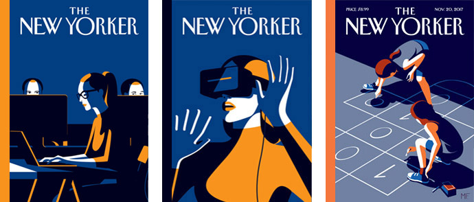
In 2017, Françoise Mouly, art director for the New Yorker covers, asked illustrator Malika Favre to work on ideas for an upcoming issue about women in the tech industry. "The brief as always was very open but also became a real challenge as soon as I started researching the subject," says Malika. She went through all the articles that came out lately about women sharing their experiences working in the tech industry. The more she read, the more depressed she became about the gender gap and how archaic the whole situation is. Her previous New Yorker cover about female surgeons was a prime example of the impact that a positive image can have on people out there. So she very quickly decided that what the world needed was something positive and forward thinking rather than an image showing the current state of the industry. So she started sketching various ideas, most of which were showing women as the central hero but always keeping a second layer of narrative.
"The woman with the AR or augmented reality glasses, for example, is shown almost as a superhero but also stands in an almost defensive position. The girl coder sitting in the dark in another sketch is at the centre of the story but the overall mood also conveys a slight feeling of loneliness. The last sketch was the one with the little girls playing hopscotch." She chose a game that was usually associated to girls and gave it a twist, a hidden story that would change its meaning and get the point across. As for today, more and more girls are learning how to code and Favre wants to believe they will change the face of this industry. Coding 101 became the fifth cover she did for The New Yorker.
The New Yorker covers are a mirror to society and allow artists to share our vision of the world with others, so it is always exciting when one get published. Malika Favre loved concepting her version — The Butterfly Effect — of the iconic illustration of an illustration of Eustace Tilley, the 19th-century boulevardier languidly inspecting a passing butterfly through his monocle. In a way this was not a conceptual cover but an opportunity for her to update an icon to something that resonates with New Yorkers (and others) today. Her approach was very instinctive for this particular one. She knew she wanted it to be a woman and a very strong elegant profile. The choice of drawing an African American woman in a dandy suit came very naturally and felt like the perfect update to the 1925 character.
Malika Favre has also made a contribution in her classic Favre style, to the cover to the March 2018 issue of Metropolitan magazine. The cover illustration is an ode to Martin Margiela, enigmatic Belgian fashion icon (from my hometown), complemented by two more illustrations within the spread. Her use of colour reminds me of scenes and depictions from a James Bond movie. She makes her characters seem like they are straight out of a movie.
"A lot of illustrators start straight out of university which, in my opinion, might be too early. Gaining knowledge of the industry, learning how to manage clients, deadlines and budgets is key to being successful. Talent is 10%, the rest is people skills, maturity, a good business sense and a controllable ego." — Malika Favre
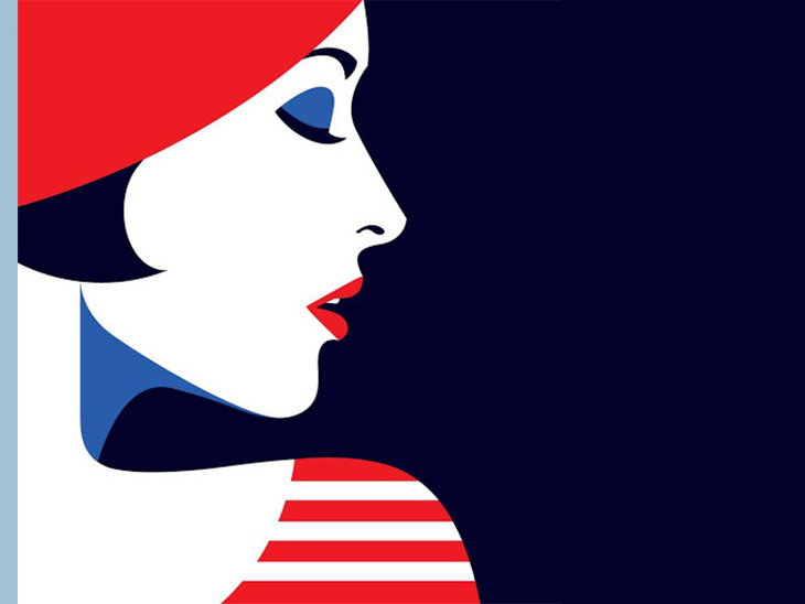
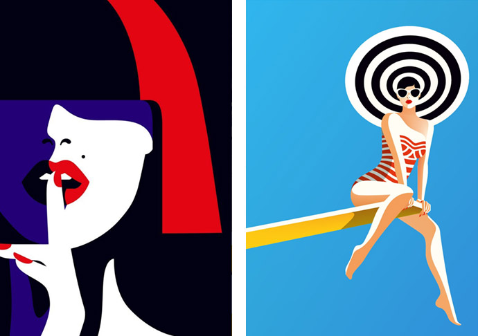
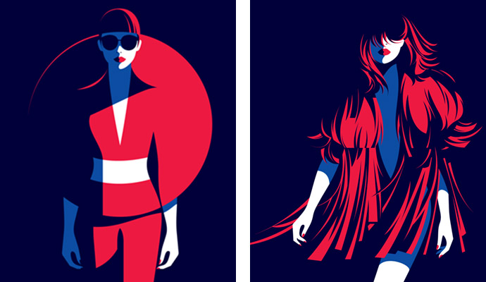
The secret of Malika Favre is to extract the details out of context, making them protagonists and able to overpower everything else. Favre creates work that is characterized by a striking minimalism: no line, no shape, no color is wasted. But within this minimalism, she creates images of startling beauty and depth. Her approach to illustration is about tearing things down as much as possible. Silhouettes fuse with the background and harmonious lines used to define the boundaries. She tries to get to the essence of her subject, using as few lines and colours as it needs to convey the core of the idea. She loves combining organic curves and unapologetic color palettes. Favre concentrates on light: almost drawing with shadows. Dark as that sounds, her work is actually some of the brightest out there in terms of use of colour. The instantly recognisable style has enabled Malika Favre to rise to the ranks of the most sought-after visual artists of the day.
She always uses warm colors such as blue, red or green. These shades give life to her portraits which are also marked by sensual geometric shapes. These forms combine wonderfully with the female bodies which are always the mainstay of Malika Favre's illustrations. We discover them in a minimalist style specific to the artist. In each of her creations, she gets to the point and gets rid of all the unnecessary details. The result is striking and very satisfying to watch, with the odd splash of humour and naughtiness.
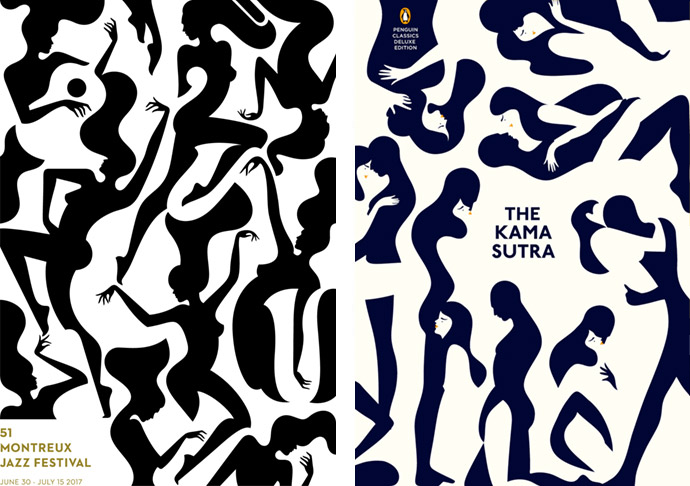
Gentle but strong, Malika Favre represents femininity in all its forms. You can even speak of an ode to women. The vast majority of Favre's illustrations feature female characters. These women are always very elegant and usually dressed in beautiful clothes and large sunglasses. Sometimes they can be found behind the wheel of a car, on the balcony of a villa or at a party. In each of her illustrations, Malika Favre highlights their body by superbly emphasizing their feminine curves. Her illustrations exude eroticism but never intrude into vulgarity, even when the work represent a Kamasutra position. Do you like to be a little sexually aroused? Check out her infamous The Kama Sutra typography project. The alphabet itself was first designed for Penguin's reissue of the Kama Sutra — a Sanskrit text that gained notoriety for advocating adventurous sex positions but is actually more like an ancient self-help manual to love and courtship.
The erotica that she does is so beautiful. It’s sexy but also quite playful and even laugh-out-loud funny. This work is very personal to her. She thinks it’s actually how she found her voice as an illustrator. While the French illustator was at Airside she designed Alphabunnies, a set of erotic letters, and a naughty Apha Pin Ups alphabet. Alphabunnies was the first time she approached illustration as what she wanted to do. It was the first piece of work that felt personal. The subject matter she really wanted to explore was erotic drawings with more of a graphic design approach, almost like a logo. It wasn’t purposefully made as an alphabet, but that became her challenge. "It's just like school but with Hugh Hefner in charge and David Lynch as your favourite maths teacher." At the time Airside had an online shop, which was a really interesting for their designers. They wanted their employees to be happy, so when they weren’t doing client work and they had down time, they could create whatever they want. They could show their free work it in the Monday morning meeting and if everybody liked it then they would sell it in the shop. All the profit from the shop was used to pay the guy taking care of it, so no-one was making money but everybody was happy.
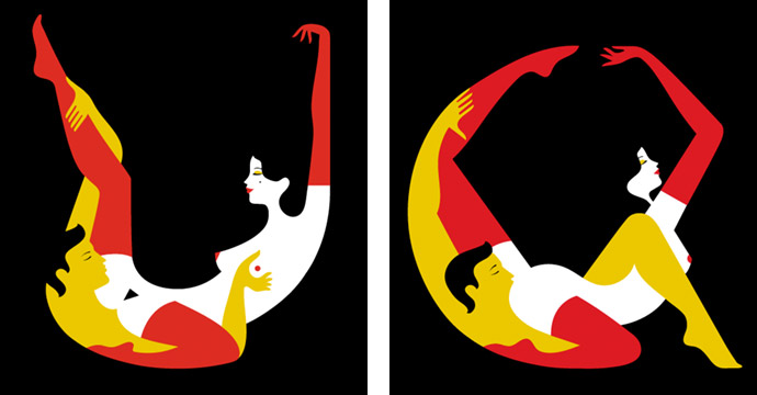
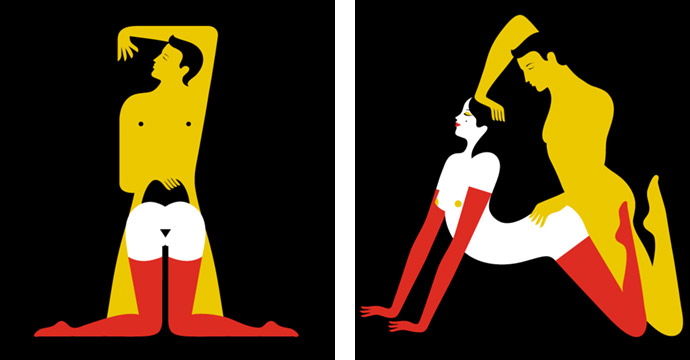
Malika Favre's Kama Sutra typeface shows sex as a "deeply pleasurable and sometimes funny act". Naked bodies pretzeled together into different sex positions form the letters of the alphabet in the Kama Sutra A-Z coffee table book to order at Counter Print.
"I wanted to show how relevant and timeless erotic poetry is as a whole and bring different voices into it. I wanted the final selection to be a mix of eras, genders, sexual orientations and tones." — Malika Favre
As a kid, she used to draw naked ladies all the time — she's always been fascinated by the human body. Also, she loves playing with things that are so broad, so universal, that anyone can relate to them, wherever they are in the world. And sex is the embodiment of that idea. It’s the most universal thing on earth. "When looking around, I realized that a lot of erotic art was done by men and was missing female voices, so I decided to share my vision. Also, I always try to add a touch of humor to my pieces, as I see sex as something playful and sometimes even funny." When Favre started, her portfolio was filled with naughty and sexy work like f.e. Orgy or 69 — but one of the things she realized very early on was that she couldn’t do that type of work commercially. Although she tried a few times, it just never worked, and she ended up frustrated by the result. It’s the one aspect of her work where she absolutely doesn’t want to compromise, so she made it a rule not to create erotic work for commercial clients.
"My artistic style can be defined as colorful, bold, minimalistic and narrative and sometimes it’s also very sexy. I seek to reduce the lines and colours in my work as far as possible. I’m fascinated by simplicity, the plays on form and counterform." — Malika Favre
The most challenging aspects of Favre's work is to constantly push herself and explore new ideas. The illustration industry can be really tricky in that you are always hired based on something you have already done, so you can only rely on self-initiated work to explore new things. Becoming a one trick pony is very easy in this industry but people and trends will eventually move on. It's better to be ahead of the curve, and to keep being relevant and current.
How does Malika Favre approaches an assignment or project? After she receives a new brief, the first thing she does is a lot of photographic research — a lot. If it’s for a specific place, she’ll go there and photograph it. If it’s for a more general concept, she does a lot of online research. Favre always start on Google, with image searches for the most obvious things she can think of that link to the brief, and then she starts jumping from one thing to the next. It’s a very organic process because she never knows what she's going to find. Then she starts sketching. She sketches digitally now, just because a lot of her work doesn’t really translate into pencil sketches — it’s all to do with colors and bold shapes. So she just very roughly drawes in Illustrator…. She always starts drawing with some kind of a broad concept in mind. But the composition is something that evolves organically. She never knows what the final piece will look like. Often the best things happen by accident, which she, and even I, finds fascinating. An idea often leads to another concept, so she goes back online and starts exploring some more. And she does that, back and forth, until she has enough ideas. Favre usually produces a lot of sketches, maybe four or five different ideas for an editorial piece, for example. And then she picks the ones that she thinks work best and present them to the client.
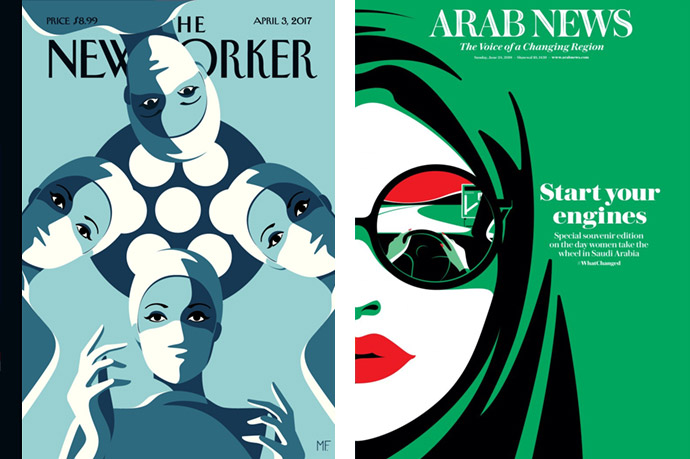
When asked about Favre's favorite assignments, she referenced Operating Theatre for The New Yorker’s Health, Medicine & the Body issue released in April 2017. In her illustration, female surgeons are arranged in a circle looking down, as if the viewer is on the operating table. In the animated version, the image is viewed as if through a blinking eyelid. Yet the cover took on a whole new meaning when Susan Pitt, an endocrine surgeon at the University of Wisconsin, issued a challenge to her fellow female surgeons to re-enact the image in real life, shining a bright light (similar to the one that you would find in an operating theatre) on the women and other minority groups working in a traditionally white, male dominated field. The response was profound, with the use of a hashtag on social media stating #ILookLikeASurgeon and #NYerORCoverChallenge. Women surgeons around the world started re-enacting Favre’s cover, sharing more than 5,000 photos. "For me, it was a very important moment," Favre said. "It reached out to an audience that wasn’t design-focused. It was something very profound that spoke to these women, and they took it as a very strong statement of let’s celebrate women surgeons." Although Elizabeth Blackwell was the first female doctor in the USA to receive a medical degree in 1849, the traditional ‘male doctor’ stereotype frustratingly stood its ground. Therefore, the wording of this hashtag was a crucial one in revoking assumptions about what a surgeon ‘should’ look like and instead reflect the changing face of the profession, quite literally, in today's society.
Malika Favre is also called "The artist who put Saudi women in the driver’s seat". In September 2017, King Salman issued a decree declaring an end to the decades-long ban from June 2018. Up until this date, it was law that women should receive a male guardian's permission to travel, a law that was one of the many discriminative to women. Some three million women in Saudi Arabia could receive licences and actively begin driving by 2020. Malika Favre, now known and renowned worldwide, was a natural choice for Arab News to illustrate their souvenir edition commemorating the day when women were allowed to drive in Saudi Arabia. For her, it was exactly the kind of subject that she wanted to work with and tackle today. She'd been increasingly involved with women’s issues over the past few years, with The New Yorker as well. And her illustration brilliantly captured the significance of that moment on the day Saudi Arabia changed forever. For the illustration, called Start Your Engines, Favre began with the idea of "something quite subtle, not aggressive, something celebratory", coming up with an image of a "beautiful, Arabic woman" that tells a story within a story. "So, basically, I had this idea of looking at the car from the point of view of the woman who is driving, and so maybe the first thing you see is a woman with a headscarf and quite a colorful image, but then on the second layer you see what’s happening and you see that she is driving the car," Favre said. "I really like the idea of this woman being on the road, because I think symbolically it’s about going forward". One woman stated "Driving to me represents having a choice — the choice of independent movement. Now we have that option", whilst another commented "It's a dream come true". The image became one of the most retweeted artworks celebrating the occasion, as well as it being the most downloaded illustration on Arab News’ website, despite its early stages of existence.
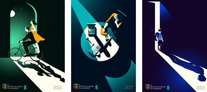
She's also very fond of her BAFTA illustrations. She loves the whole concept behind it, the story each image tells and how simple they look in the end. This project uses everything: narratives, shadows, optical tricks and carefully chosen palettes. She got her inspiration from everyday life and the people around her, objects, fashion and travel above all. Favre now has the luxury of being able to spend half the year travelling and the other half drawing.
In the fall of last year, likely the most-prolific illustrators working of today, Malika Favre released her first monograph. It is a very complete overview of all her illustration work to date and also a good summary of everything I have written about her before. She has published an eye-catching book that takes a closer look at her trademark blend of vector shapes, refined palettes, and inventive use of space. Bold shades and optical illusions are aplenty, but her ability to camouflage hidden surprises in her work often begs the close inspection. Colour is used sparingly but effectively, with Favre opting for complimentary shades rather than dramatic clashes. Her palettes serve to enhance rather than distract, while her razor-sharp vector shapes and clever use of negative space offer something new upon second glance.
While the globe is still being affected by COVID-19, either in lockdown, or the aftermath, the quarantine certainly hit us. For Malika Favre personally, she had been working from home for the past 8 years so she didn’t need to adjust to a new routine as such, but what she realized was that her pace of work changed during quarantine. Illustrators are used to working remotely, and especially with photoshoots being canceled she ended up with more work than she needed — which was extremely lucky. That being said, she became slower and found it harder to motivate herself. The first month was the hardest but it eventually became a time for reflection and introspection. I think this is the case for many creatives. Her pace of life was very hectic before that especially with travelling, so being forced to stay put allowed her to center herself and to realize that she didn’t really need all these things to be creative and happy. She feels very lucky to be in her flat she loves with a job she loves and a person she loves. This is the real luxury.

With her works, Malika Favre built perfect balance upon color, shape and shadow, the three constructs of her style. The images she draws rely on strong forms and contrasts, which altogether pop off the page with cinematic quality and a powerful message that she conveys with no words but with bold minimalism.
Stay amazed!
All images courtesy of the artist.
See/read also some story related movies/interviews:

Related stories on Woodland:

1 comment
Hello Joel
Thank you for your email and for sharing your journal. It’s very nice of you to have done this and she is ok with the content so you can make it viral.
Regarding Martin Margiela, Malika actually never met him. She created the piece based on an article.
Have a nice evening!
Best
Léa Biribin
Personal Assistant